ㄱ의 순간
조선일보 창간 100주년 한글 특별전
예술의전당 한가람미술관 제 7전시실, 서예박물관 전관
2020.11.12~2021.02.28
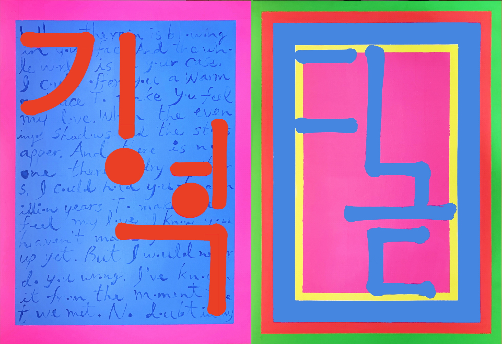
This series of works with giyeok (ㄱ), nieun (ㄴ), digeut (ㄷ), and rieul (ㄹ) (names of the first four consonants of hangeul, the Korean alphabet) written in paint are mainly composed of fluorescent colors that reinterpret the five cardinal colors of Korea. The lines and dots that make up each character serve as the overall framework, and the colors within each frame intersect and integrate each other. The lyrics of a pop song, an old Korean folk song, and a Korean pop song written in the background in English, Chinese, and Korean demonstrate hangeul’s warm and welcoming nature. Behind nieun are the original lyrics to the old Korean folk song “Seodongyo,” while behind giyeok are the lyrics to Bob Dylan’s “Make You Feel My Love,” and behind rieul are the lyrics of the popular Korean song, “Love Inside a Dream,” which is an adaptation of a song that was originally released in China. The emotion of love as sung by people of the East, the West, the past, and the present is translated through Korean characters. The two dominant colors, dots, and lines that constitute the work represent the harmony between yin and yang that embraces disparate meanings and conventions. Through the work, the cardinal colors become fluorescent, and the lyrics of the folk and pop songs become poems in which the viewer becomes presently involved. By reducing the Korean characters down to unique dots and lines, the work gives synesthetic form to sound, text, and image.

작품 ‘기역, 니은, 디귿, 리을’은 각 글자마다 한 점으로 구성된 총 4 점이 하나인 회화이다.
오방색을 재해석한 형광색이 주조 색이며 각각 두 색을 하나로 묶었다.
각 글자는 직선과 점으로 화면의 뼈대가 되고 각 작품 안에서 색들은 서로 교차, 융합한다.
먼저 주조 색으로 바탕을 칠하고 서동요와 국내외 팝과 가요의 가사를 한글, 한자, 영문으로 쓴 후, 다른 주조 색의 큰 붓질로 ‘기역, 니은, 디귿, 리을’의 각 글자를 화면 가득 드로잉으로 그렸다.
대체로 자모 ‘ㄱ,ㄴ,ㄷ,ㄹ’의 의미 부각을 위해 색, 모필의 에너지를 극대화한 ‘쓰기’와 ‘그리기’이다.
작품을 구성하는 두가지의 주조 색과 점, 선은 각각 의미와 형식을 포괄하는 음양의 조화이다.
인문적으로는 한글 이전의 가장 오래된 향가 ‘서동요’와 국내외 팜과 대중가요의 가사, 한글의 기본단위가 어우러진 동서고금의 대화와 같은 서술이다. 소리를 묘사하거나 형상화 한 글자들이 재해석되어 또 하나의 글씨가 되었다. 주지하듯 ‘글씨’는 사전적 의미로 ‘글자의 모양’을 말한다.
작품은 동양정신을 기반으로 하며 다원적이다.
오방색을 ‘형광색’으로, 향가와 대중가요의 가사를 현재 시점의 ‘내’가 개입된 ‘시’로, 한글 글자의 모양을 독특한 ‘점과 선’으로 재해석하여 소리 글씨 그림을 공감각적으로 형상화 했다.
이는 주로 시, 서, 화와 오방색 등 전통적인 동양 화적 요소를 다중매체와 융합하여 인문적으로 변용하고 공감각적으로 구현하는 작업 특성의 연장이다.
결과적으로 이 작품은 상대적이거나 다중적 요소를 차용한 융합이 정체성이되어 다원성을 함의하며 융합의 대상을 음과 양의 조화를 꾀하는 동양정신으로 논함으로써 작품의 본질을 객관화한다.

기역니은디귿리을 220x640cm, acrylic on canvas 2020
기역디귿 220x320cm, acrylic on canvas 2020

니은리을 220x320cm, acrylic on canvas 2020

기역니은디귿리을 220x640cm, acrylic on canvas 2020
